Asobi Arcade & Claw Games
Branding, Graphic Design, Animation, Merchandise
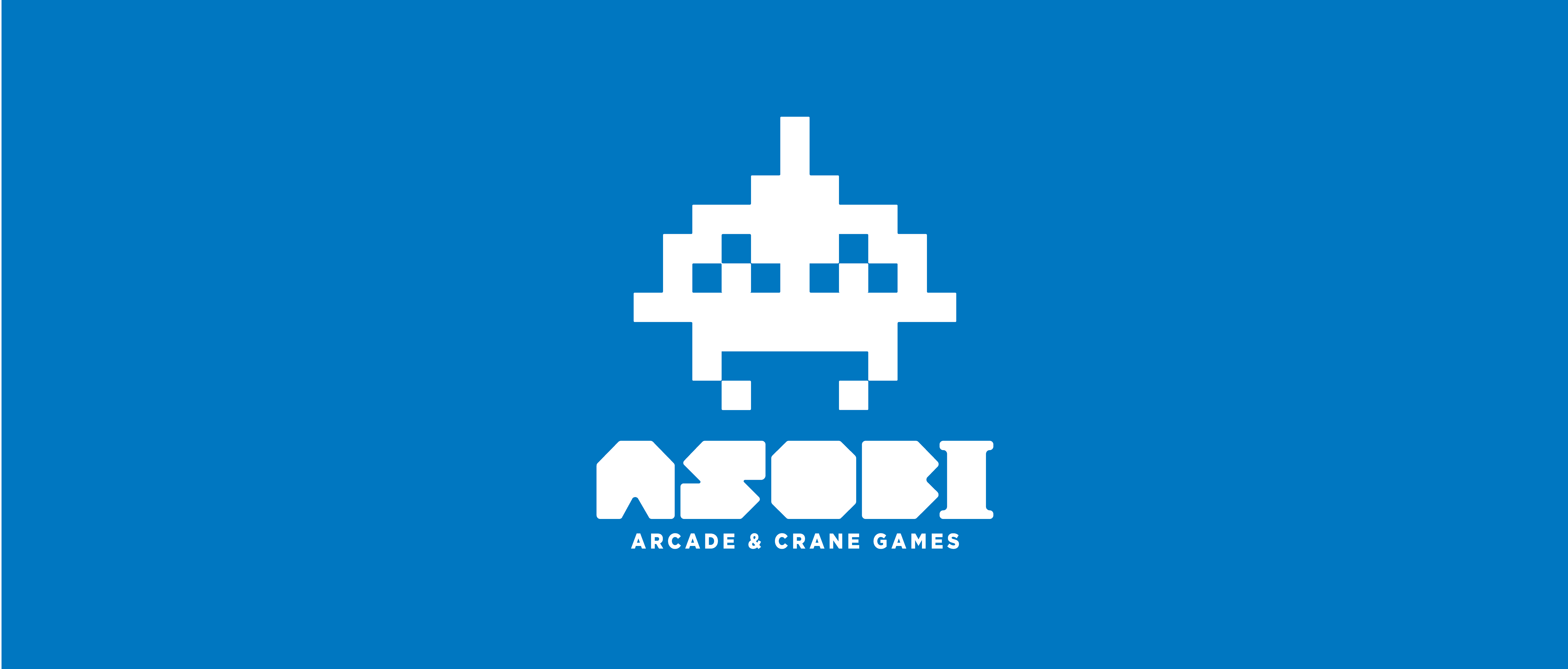
ASOBI was built around a simple idea: play should be part of the identity. The brand combines the bold geometry of classic arcade graphics with a friendly character, capturing the anticipation and enjoyment of crane games.
The custom wordmark gives ASOBI its distinctive rhythm through chunky lettering and angular cutouts. A crane claw becomes the brand’s central icon, with a simple pair of eyes giving a familiar mechanism personality. Set within the “O,” it connects the name directly to the arcade experience while standing on its own as a recognizable symbol.
Bright blue anchors the identity, while yellow and white bring warmth, contrast, and energy. The shared geometry of the lettering and icon carries across signage, packaging, stickers, and merchandise, keeping the brand connected at every scale.
Every element was designed to feel like part of the same world—bold enough to draw people in, friendly enough to make them feel welcome, and playful enough to make them remember it.