

PeopleGrove
Case Study
Role
Project Lead, UX/UI Designer, UX Researcher
Toolkit
Figma, Adobe Illustrator, Miro, Maze
Background
PeopleGrove is a career development platform that connects students, alumni, and professionals through mentorship, networking, and experiential learning. Designed to support career readiness and lifelong connections, it helps users grow their networks, access industry insights, and navigate their educational and professional journeys with confidence.
Project Goal
PeopleGrove seeks to develop the mobile version of its web application within an accelerated timeline. Accordingly, the minimum viable product (MVP) will prioritize usability, efficiency, and user-centered design to ensure a functional and intuitive experience that can be effectively delivered and evaluated within the constraints of the design sprint.
Research
Research Goals
Improve the usability of the PeopleGrove dashboard to reduce user error, increase application completion rates, and build trust in the capstone matching process.
Methodologies
The following methods were used in order to conduct the research on PeopleGroves current web application.
Usability Testing
User Persona
Empathy Mapping
Journey Mapping
Meeting Our User

Jordan's Goals and Pain Points

What did we observe during Jordan's Usability Testing?

Analyzing the Application Process
Jordan's Journey

Opportunities for Improvement

Design Process
My Role
As part of our team’s project to create a mobile version of the PeopleGrove web application, my focus is on designing and iterating the process of applying for a project starting from the dashboard page. Due to time constraints, this will be the only user flow I refine, while my teammates handle other sections of the mobile app to ensure a timely launch.
Project Goals
Design and optimize the mobile user flow for applying to a project from the dashboard within the PeopleGrove application.
Design System
This design system, built on a short timeline, focuses on the most essential elements including buttons, tags, typography, colors, and effects, to maintain consistency and efficiency across the product. By prioritizing only what was necessary, it provided a clear foundation for designers and developers, reduced guesswork, and streamlined the design-to-development process. This lean yet effective approach allowed us to move quickly while ensuring a cohesive, user-friendly experience that can scale without sacrificing brand consistency.

Wireframe Design

Lo-Fidelity Prototype Design

Usability Testing
Objective of Usability Testing
Evaluate the usability, clarity, and task success of the redesigned mobile experience for UX Design students applying to their capstone project via the PeopleGrove platform.
Jordan's Task Assignment
Jordan, a UX Design Student is attempting to apply for the final capstone project for their course.
What Does Success Look Like?
The successful end state includes Jordan receiving a clear confirmation screen and returning to the project page.
Reintroducing Jordan

Key Observations

Key Insights & Trends
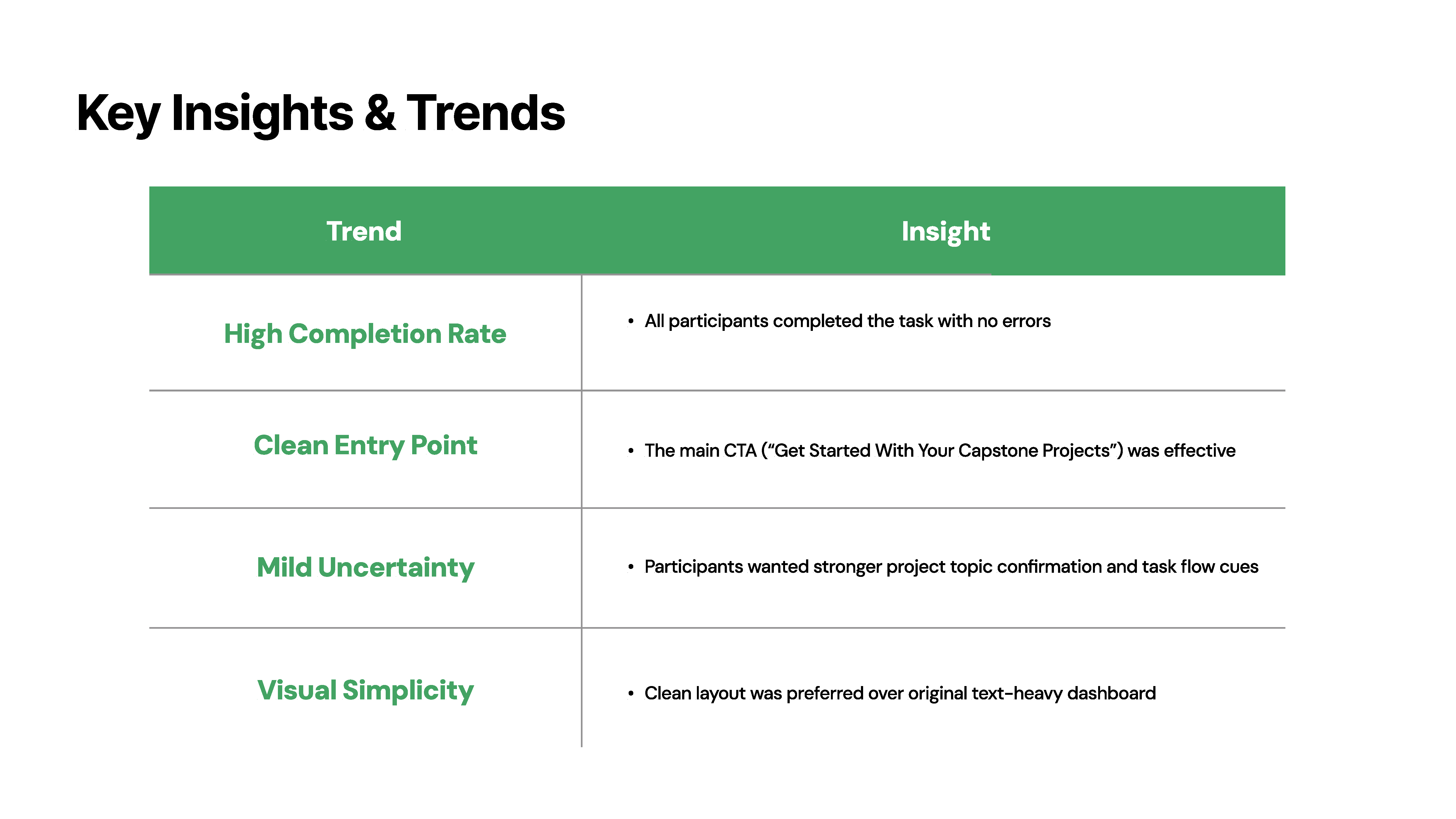
Where Can We Improve?

Final Prototype
Key Takeaways
Next Steps
Implement quick-win UI changes (labels, step indicator, hierarchy)
Continue testing remotely with real WGU students via Maze or moderated sessions
Extend UX improvements to internship recommendation flow, search filtering, etc.
Challenges Faced
This project challenged me to think beyond only layout and aesthetics, to design for user confidence as this issue seemed to be the center point of user discomfort and distrust.
Lessons Learned
It wasn’t just about making things look cleaner. It was about removing hesitation. The original dashboard made students second-guess nearly every step. My goal became not just to guide them, but to reassure them. Every button, card, and confirmation state had to feel like, “Yes, you’re in the right place”
I also learned how fragile trust is in a user flow, and how small things like vague labels or extra text can break it. By watching even simulated users hesitate or pause, I saw how clarity isn’t just helpful, it’s emotional. It’s the difference between someone completing a capstone with confidence… or giving up and emailing support
Lastly, this taught me to respect the quiet power of structure. A well-placed CTA or simplified page hierarchy did more for usability than any color or animation ever could
